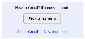
Gmail New Signup Button
A slight update to the Gmail homepage by replacing the old tedious single line 'Sign up for Gmail' with the Mac style 'Pick a name »' button and a call to action statement 'New to Gmail? It's easy to start.'

 If you were new to Gmail, would you be attracted to sign up? Which do you think is better?
| Related: Keep up-to-date with the news and updates of Gmail by subscribing to their newly established blog. |


3 comments:
I liked the original link signup.
The new one just doesn't fit their whole minimalizing on images stance.
I think it should be a non-graphic link. It alerts my security because it's an image load and asks me if I want to process every time. This is a default setting on most of my computers so it's a pain to see every single time.
first.
second one if it were actually submitting your reg info, but 'Pick a name' is not intuitive text either...
Post a Comment
New! You can now receive emails whenever there are follow-up comments by signing into Blogger.
Off-topic posts will be deleted